Saturday, August 9, 2008

Blue & White Ming

When I see examples of these fine ceramics, my heart races. I get Ming fever - bad. I have spent hours & hours just staring at them: mesmerized. First intentions may be noble, but they're not always practical... and so over the next year I will return to this post as a cornerstone to build & expand upon. But I digress, and in haste, will plunge straight in.

Ceramics destined for a European market began to be manufactured in small volume in the 1520's for the Portuguese and in greater volume by 1630 for the Dutch. The early Chinese market did not export 'much' .... and the ceramics were cleaner looking. By that I mean uncluttered and balanced - depending on the motif and whom it was made for ie the Imperial Palace or anyone else lower down.

For the most part, we Americans know Blue Willow and Flow Blue inside and out like apple pie...they are rather common stencil based patterns whereas the Chinese patterns were drawn freehand. The early Chinese work that dealt in blue began in the 14th century and the potters and artists used Mohammedan (Persian) cobalt...the Chinese domestic supply of cobalt had a grayish or purple tone and lacked the depth of blackish blue the imported had.

If a harmonious and sparse pattern was shipped to Europe...woe! Often these pieces had more color added to it or 'other' colors and then it was reglazed and fired again to meet the European customers desires. These busy and crowded pieces are refered to as clobbered and Europeans and soon-to-be Americans loved them this way.

For examples, I have chosen a few Ming porcelain pieces...not to say that later dynasties or kraake, or ko-sometsuke pieces are not as good, I just prefer the pieces made around Chenghua's reign. This is what I want to focus on - the essence of artistic free drawn pieces and their rich color. And so, if you ever find yourself at a yard sale and have a gut feeling about a piece here are a few tips - from an amateur.

Study the surface....does it have an orange peel texture? Yes, just like orange rind. If so, you're probably holding an old piece.

Very black spots on the painted leaves and other brush-stroke end points? This is caused by the heaping and piling effect and the Mohammedan cobalt gives it - this intensely cherished deep black tone.... also called, "vivid."

The overall execution is crisp, detailed, sharp and refined....does not feel stiff or contrived. Does feel fluid and effortless. It's the fluidity that is the signature of a master.

And with this, please enjoy these beautiful works of art.


Duncan MacIntosh


Hi Li


Slelagh Vainker


A stunning plate made for the Persian market. Note the fluidity. Yuan Dynasty. 14th Century.


All images came from Li, MacIntosh and Vainker's ceramic books.


Aside from visiting the not-always-in-the-neighborhood museum, Sotheby's sold archives are the place to be. As of this morning there were 427 lots on 22 pages under "Ming blue & White" and I am sure there is more under other 'labels.' And the zoom feature is fantastic!!!

Wednesday, August 6, 2008

Tick tock till the Friday Photo Shoot!

Over the last 2 years we've worked on a gorgeous home near Lake Winnipesaukee, NH and finally, this Friday, it'll be shot by Ellen McDermott (Martha Stewart Living, Country Living, Albert Sack etc) for Accent Magazine's spring or summer '09 issue. Ellen has a diverse portfolio if you'd like to see some stunning photography.

Thursday is the final prep day and we're running hard and having a blast...gotta go, more to do!

Tuesday, August 5, 2008

Suzanne Kasler & Hickory Chair

This spring Hickory Chair unveiled beautiful new furniture designs by Suzanne Kasler at the High Point show. Prior to the unveiling, I had a few ideas as to what to expect...that is, from her French and Italian inspired pieces. I had just sold a beautiful Empire Revival French settee and when I saw the carved details that Suzanne had incorporated into her work, I knew, deep down she had reclaimed the soul from some fabulous pieces of furniture.

Prior to walking into the showroom, I attended Suzanne's sold out design lecture. Hats off, she's good. Throughout the slide show she spoke of using small amounts of color to pop a setting or room and how versatile and impactful a few accessories could be in a soft room.

Enjoy the tour....and visit The Peak of Chic for more great Kasler pictures from the grand party at Mrs. Howard's .


Suzanne gave this room some personal zing and character using the trim on the curtains, chair and stool.


Of course, her signature Alexandra Chairs.


Notice the attention to fine details.


If you have any questions on these pieces, please call or email me....and yes, I am a Hickory dealer.

To see more Kasler - Click Here.
Like her Aetlier wood look? Then you may enjoy these Swedish lines.

Suzanne Kasler

These beautiful pictures are from Suzanne Kasler's lovely portfolio. I perused through her site whenever I need a little inspiration.


Monday, August 4, 2008

Pillows Galore

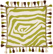
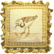
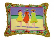
Got to love those animal print pillows...and as the saying goes, "you should have some animal in every room" can be so true. Fabric companies like Scalamandrie, Cowan & Tout and Lee Jofa to barely scratch the surface, have created some delightful textures and prints in a wide variety of color. These are a few of my latest buys.... who makes your favorite pillows?


Celerie Kembele's line, Valtekz (see below) has some fabulous composit fabrics that would look stunning outdoors...of course I admit they'd look out of place here in New England, but in Miami, LA or Scottsdale....oh yhea.